Designathon
Design For America
Design For America : Blue Zones
Modernizing the Blue Zones Website
Problem Statement : We are redesigning the Blue Zones homepage to streamline information and enhance usability, making it easier for users to engage with its well-being initiatives and research. Introduction The Blue Zones Project is dedicated to improving community well-being through environmental, policy, and lifestyle changes. However, its website presented challenges in usability, navigation, and information accessibility, making it difficult for users to engage with its valuable content. Our goal was to redesign the homepage with a more intuitive structure, clearer information hierarchy, and a modernized UI that aligns with Blue Zones' mission. Through heuristic evaluation, user analysis, and UI improvements, we focused on simplifying navigation, enhancing readability, and ensuring key content is easily discoverable. The redesign prioritizes clarity, consistency, and engagement, creating a user-friendly experience that better reflects Blue Zones' values and impact while making it easier for visitors to learn, explore, and take action.
Nonprofit ROLE EXPERTISE Duration Blue Zones UI/UX Designer Redesign January 2025 - April 2025
Research Findings
👥 Research Methods & Insights - Heuristic evaluation of the existing site - Internal UX audit from the perspective of first-time users - Analysis of information hierarchy and visual patterns Key findings: 1. Navigation bar was inconsistent and cluttered 2. Button styles and spacing lacked coherence 3. Users experienced high cognitive load on the homepage 4. Stakeholder CTAs (like “Shop” and “Newsletter”) were lost in the layout
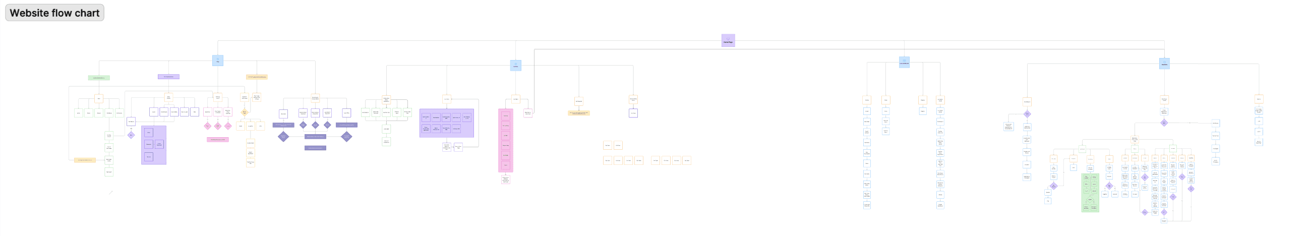
🧩 Problem The original Blue Zones homepage lacked clear information hierarchy, accessibility, and design consistency. It presented a cluttered user experience that made it difficult to navigate or engage with key content.
Low & Mid Fidelity Designs
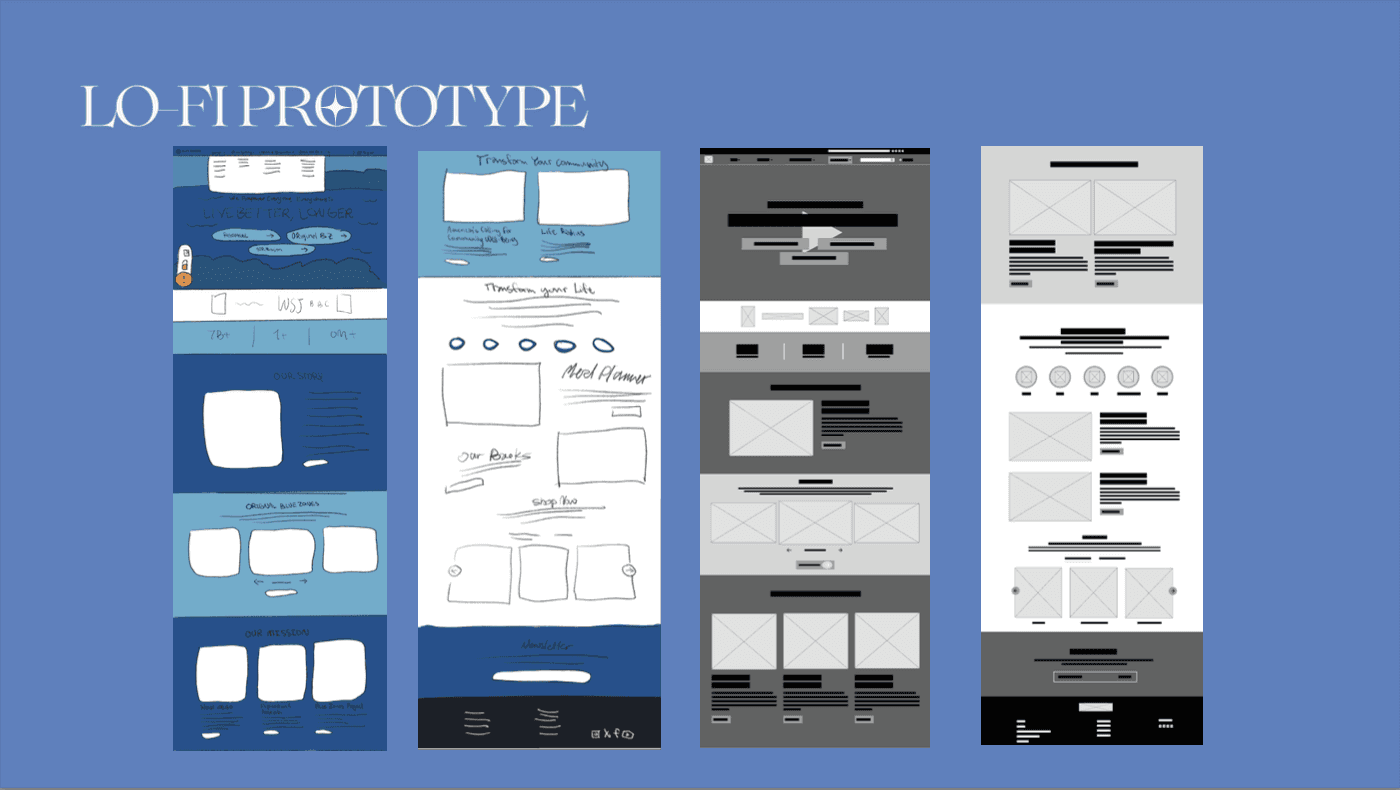
🎯 Goals 1. Streamline the homepage's information architecture 2. Improve usability and accessibility 3. Align visual design with Blue Zones’ brand values 4. Emphasize stakeholder priorities, like the shop and newsletter
🔍 Justifying Design Choices - Used complementary blues for improved readability and branding - Anchored content to reduce scroll fatigue and direct attention - Prioritized accessibility standards in button contrast and spacing - Structured navigation by grouping CTAs, simplifying dropdowns, and making key actions (like “Shop”) stand out
🛠 Iterations & Challenges - Major design challenges stemmed from aligning stakeholder goals with UX best practices - Coordinated changes to button styles, colors, and spacing to support accessibility - Navigation bar redesign went through several versions to support better recognition over recall and efficiency of use
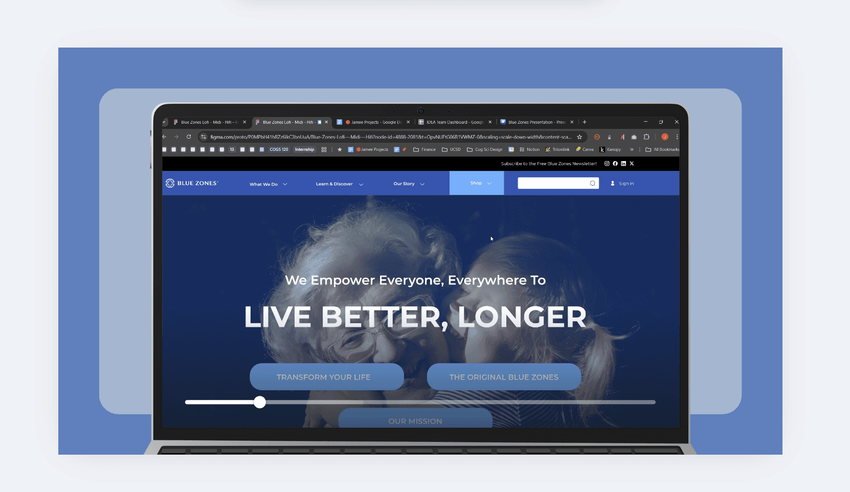
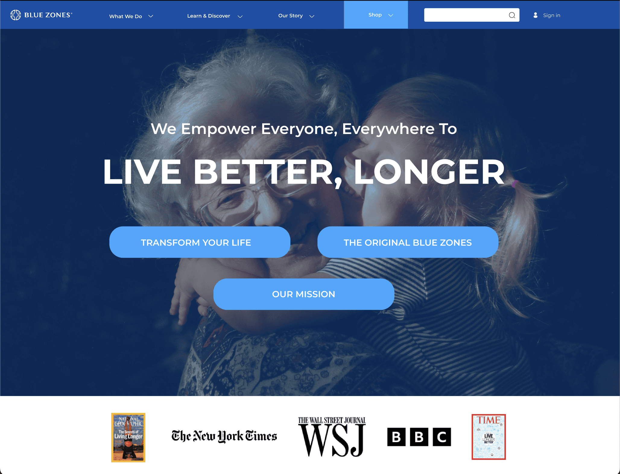
High Fidelity Screen
(view all high fidelity screens on the prototype link)
🔮 Future Opportunities - Usability testing, stakeholder interviews, deeper redesigns of secondary pages - More user testing could validate new hierarchy decisions and uncover pain points - Added features like improved iconography, integrated AI suggestions, or interactive modules could further boost engagement
Design For America : IDEA Blue Zones Website Redesign My Final Thoughts & Impact
The Blue Zones website redesign aimed to create a more intuitive, engaging, and user-friendly experience that better reflects the organization’s mission of promoting healthier, longer lives. By improving navigation, streamlining content hierarchy, and enhancing visual consistency, the new design helps users more easily access key information and take action. While there’s always room for further iteration and testing, this redesign lays a strong foundation for clearer communication, stronger user engagement, and a more effective digital presence for Blue Zones.
v